
BOHUS-LUGOSSY FOUNDATION
Contemporary Art FoundationBohus-Lugossy Foundation was created by the daughter of a glass artist couple, Zoltán Bohus and Mária Lugossy. The international foundation aims to bring together contemporary glass artists from around the world through workshops, residency programmes, exhibitions and other events, drawing on the couple's rich heritage. In 2022, the Foundation was also the organiser of the International Year of Glass 2022 in Hungary.
The logo evokes the styles of the two artists' work: Mária Lugossy created rounded, spherical, inward-facing, lenticular sculptures that often conceal their message deep within the form, while Zoltán Bohus developed his unique style by layering sheets of glass. The letters 'o' in the logo reflect the fact that while the work of Mr Bohus is best when viewed from a distance, the other is more introspective. The complementary 'o' also indicates the interconnectedness of the artists' professional and personal lives. The Foundation will be involved in a variety of activities in the future, so it was also important that the logo and the identity could be developed further.
A work by Zoltán Bohus, in which the horizontal layers are clearly present.


A work by Mária Lugossy, which features her characteristic lens shape, as well as inward-facing, closed motifs.
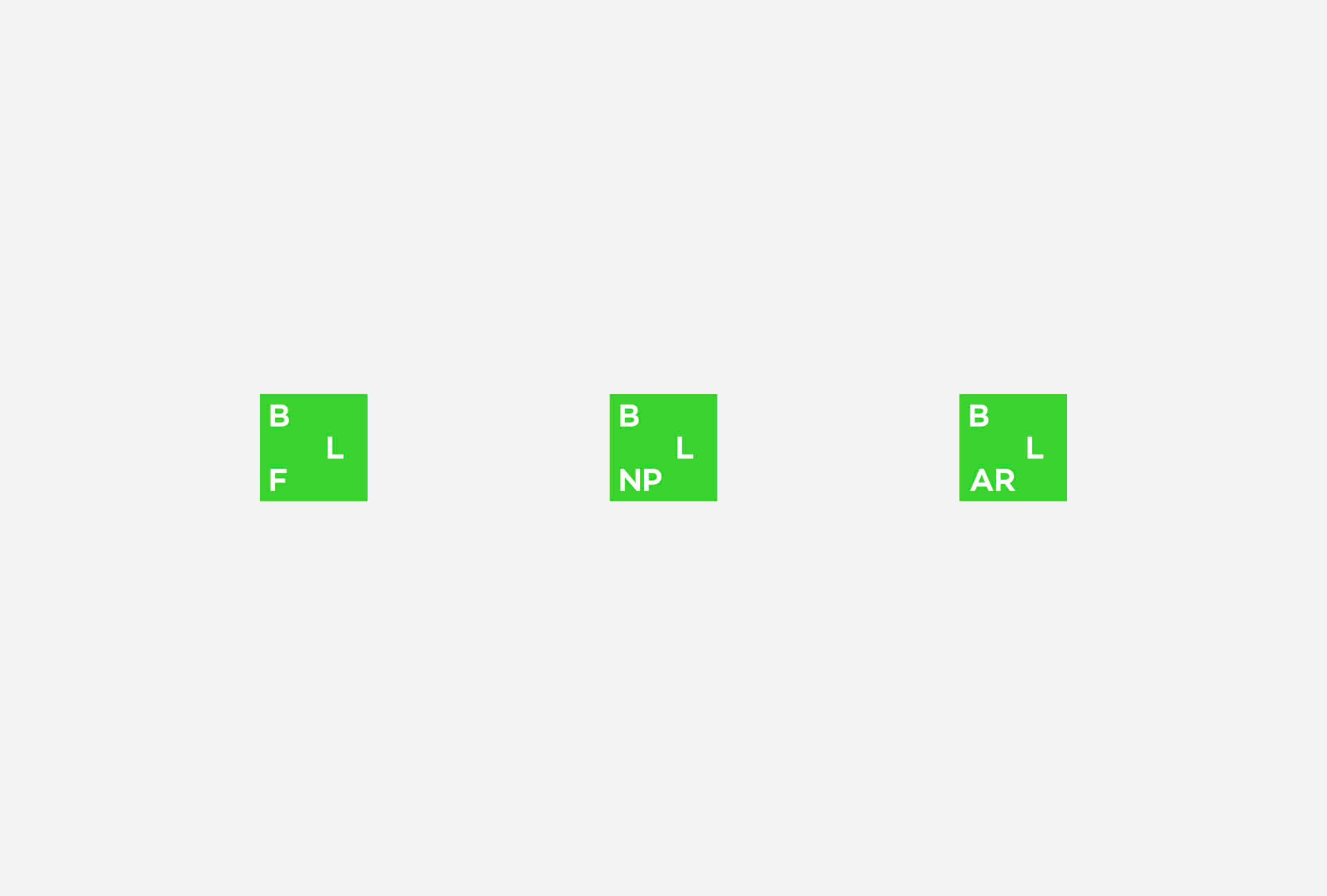
Since the name itself is quite long, it became necessary to shorten it, but in a way that still reflects the different organizational units. The solution we created is also suitable for displaying the graphic identity on smaller surfaces—such as on social media or the spines of publications. Even in the smaller versions, the logo’s original playfulness and versatility are still evident.
The glass's subdued green appears in a contemporary, bold, and progressive shade of green across the visual materials. The colour transitions evoke the play of light created in the material.
We also created custom stationery elements for the foundation, made from premium papers and complemented with unique, handcrafted solutions. Duplexed, edge painted and debossed business cards and unique folder designs were part of this process.


On the various promotional tools, we also applied the brand color: this very vivid, vibrant green, which is excellent for attracting attention. The motif of layering and the light play created by the glass also appear on these materials. Beyond that, the typography and the system of text arrangement are also based on the layered approach, just like elsewhere in the visual identity.


